Space, flow, and pathway management: a practical guide to improving the customer experience
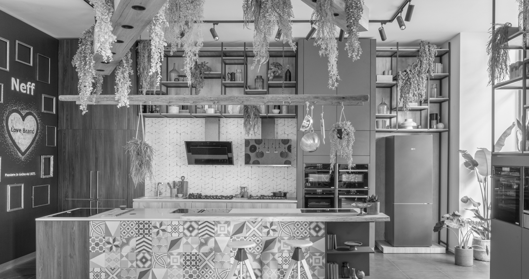
When designing an effective trade show booth, a showroom or temporary store, it is easy to focus only on the scenic effect. But those who visit these spaces will mostly remember how they felt as they walked through them. Whether he understood where to go, whether he found the right place to stop and talk, and whether the experience was smooth or tiring.
In this abridged version of the guide, we will see how to work in a practical way on spaces, flows e paths to improve the customer experience at trade shows and in corporate exhibition spaces, with a concrete look for marketing managers e designers.
Before the plant: clear goals and real people
The most effective way to design a layout is not to start with the floor plan design, but with three basic questions: what needs to happen in the space, who we want to bring in, how this moment fits into the customer journey.
What needs to happen in the exhibition space
One exhibition space can do many things, but it cannot do them all at the same level. Before even choosing the layout it pays to decide what the priority is:
- Getting people to discover a new range or product launch;
- Generate qualified contacts for the sales network;
- Strengthen brand positioning;
- Building relationships with partners, distributors or the press.
Once the main objective is defined, the display plan and distribution of functions must make it obvious: what matters most cannot end up at the back of the path, hidden behind other content.
Who do we really want to bring in
In a booth not all visitors have the same value. Buyers, designers, end customers, press, partners-each has different needs and times. Designing with “everyone” in mind almost always leads to a generic experience.
Better to choose one or two priority profiles and build the path first and foremost for them. The curious visitor must be able to grasp the essence of the brand in just a few steps. Those with real interest must find, effortlessly, the areas for technical insights and spaces for dialogue.
Connecting the space to the customer journey
One trade show booth is not an isolated incident: it is a stage within a larger journey. Before the visit people have seen campaigns, emails, social content, invitations. After the visit they will receive follow-ups, technical materials, business proposals.
If the physical experience is not consistent with this path, discontinuity is generated. On the contrary, one effective corporate showroom that echoes visual language, messages, and tone of other touchpoints reinforces brand memory and makes subsequent marketing efforts more effective.
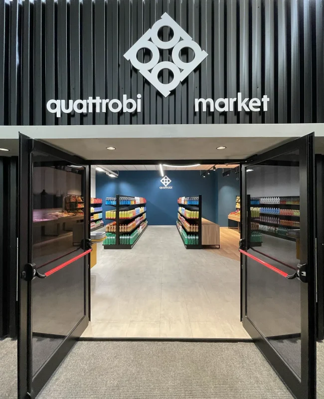
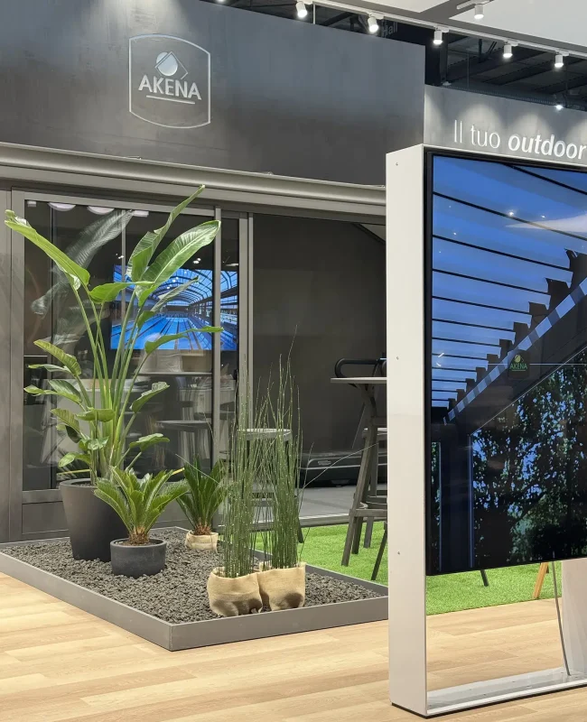
Choose layout: open, guided or hybrid
Having clarified objectives and targets, the next step is to choose the exhibition layout: how people will enter, move in, and leave.
Open layout: lower the input threshold
In the open layout space is immediately legible, entrances are wide, barriers minimal. It is the ideal choice when you need to intercept a lot of traffic, lower the entry threshold, and make it easy for even those who are not yet familiar with the brand to enter.
Advantage: opportunities for first contact are multiplied. Risk: If there are no clear points of interest inside, people get in and out very quickly. Therefore, the project must include some “anchors” that invite people to continue the journey.
Guided path: orchestrating attention
In guided route the floor plan accompanies the visitor step by step, with a clear direction of travel. It is useful when you want to tell a structured story, explain complex processes or build an immersive experience.
Advantage: attention is orchestrated, content follows logically, sales team works on a coherent narrative. Risk: If the path is too rigid, those with little time feel “caged in.” Hence the need to provide shortcuts and intermediate exits.
Hybrid layout: flexibility for different people
In many cases, the best solution is a hybrid layout: an open front space, some areas with a guided path for those who want to explore further, a more collected area for meetings and negotiations.
This approach makes it possible to:
- welcome passersby and curious visitors;
- Direct those who show interest to thematic islands or demos;
- Provide dedicated spaces for those who need to discuss concrete projects.
For a marketing manager means being able to manage traffic volumes and quality of interactions at the same time, without forcing everyone to have the same experience.
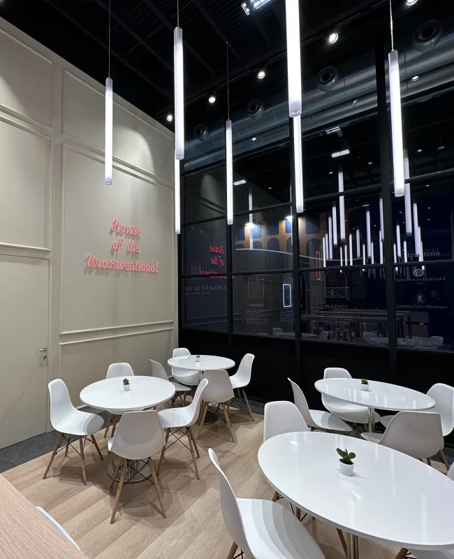
Functional zoning: giving each area a role
Chosen the layout, the next step is the functional zoning: dividing the space into areas with a specific role. This is where marketing objectives, operational needs, and visitor behavior begin to translate into square footage.
The key areas of an exhibition space
In almost every set-up we find some recurring functions:
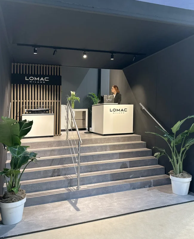
Reception
Where the visitor decides whether to enter. It must be visible, accessible, consistent with the tone of the brand. An important part of the relationship is played out in a few seconds.
Short story
the area where the brand explains who it is, what it does, why it is different. Institutional walls, narrative panels, synthesis installations: this is the key to the rest of the space.
Trial and demo
Where products and services become concrete. Ergonomics, safety, and clarity of gestures are essential to allow the visitor to experience without embarrassment.
Report
tables, lounges, lounges. These are the spaces where we really talk about projects and opportunities. Acoustic comfort, light, and perceptions of privacy count here.
Service and back office
warehouse, archives, technical storerooms. Visitors do not see them, but the quality of their experience also depends on the order and functionality of these areas.
One functional zoning well done is one in which each area has a recognizable task and connects naturally to the others, without overlaps or holes.
Spaces for breathing, waiting and transit
In addition to the obvious functions, there are spaces less “visible” but critical to the quality of the experience: the breathing zones, waiting areas, and transit corridors.
Breathing spaces avoid visual overload, allow information to settle and offer micro-breaks between content. Waiting areas turn the time before a demo or meeting into an opportunity to better enter the brand’s world. Aisles, when properly sized, keep the flows without bottlenecks, avoiding both congestion and a feeling of emptiness.
Managing flows: making movement natural
A layout effective is not enough: we need to understand how people will actually move in space. Managing the flows means designing inputs, outputs, and paths so that each step is intuitive.
Readable inputs and outputs
In crowded settings, the visitor’s first decision is very simple: go in or go over. Therefore, the entrance should be immediately recognizable, unobstructed, and aligned with the main corridors.
The exit also plays an important role: it must allow you to leave the stand without crossing crowded areas again, to avoid the feeling of “being trapped.” Good access design contributes directly to the perception of comfort.
Main route and in-depth routes
Within each exhibition space there are always a main pathway, which most people will follow almost instinctively, and some secondary paths.
The main one should lead easily from the entrance to the heart of the proposal, alternating between moments of impact and areas of pause. Clearly recognizable secondary pathways invite those who are more interested in learning more about specific topics, visiting technical areas or participating in demos.
The goal is to leave freedom without creating confusion: everyone must immediately understand where they are, where they can stop and how to get out.
Avoid bottlenecks and dead zones
Two frequent mistakes are bottlenecks and dead zones.
Bottlenecks arise where the space is not commensurate with the number of people: narrow entrances, forced passages, demos placed in transit points. Dead zones, on the other hand, are surfaces that are almost never used because they are poorly visible or poorly connected to the rest of the route.
Observing the actual behavior of visitors in the first few hours of the event, and being prepared for minor adjustments on the spot, often allows us to significantly improve the smoothness of the flows.
Wayfinding and signage: making the space understood at a glance
Once defined layout, zoning e flows, comes into play the wayfinding: the system of visual and textual elements that helps people find their way without having to constantly ask for directions.
Three levels of signage
A system of signage effective works on three levels:
Macro
helps to understand from a distance where the booth, where the entrances are, what is the main direction of visitation. Tall signs, volumes, graphic walls play a central role.
Meso
organizes internal areas, making functions such as reception, demo, counseling, technical area, non-accessible warehouse legible.
Micro
accompanies the individual product or content, with labels, short descriptions, data sheets or QR codes for insights.
Working consistently on these three levels means reducing cognitive effort and freeing up time and energy for brand dialogue.
Integration of physical and digital
Today the wayfinding is no longer just physical. QR codes, screens, dynamic content and web applications can extend the experience beyond the perimeter of the booth.
The important thing is to use digital to simplify: to lighten physical panels, to offer on-demand insights, to allow the visitor to save useful content and contact information for later. It is not about adding technology for its own sake, but intelligently extending the experience begun in the exhibition space.
Comfort and perception: designing how you are in space
The quality of the customer experience also depends on more subtle but immediately perceptible elements: light, acoustics, materials, ergonomics.
Good lighting makes content readable and highlights what is really important, without glare. Controlled acoustics allow for effortless speaking and listening, even in noisy settings. The density of the space should be calibrated according to the expected number of people, avoiding both crowding and the “empty” effect.
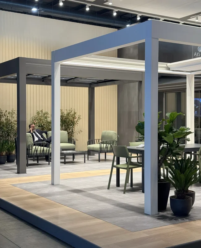
Special attention should be paid to the points of rest stops and areas of relationship: comfortable seating, adequate light, perception of privacy. These are the places where an important part of the commercial outcome of the event is decided.
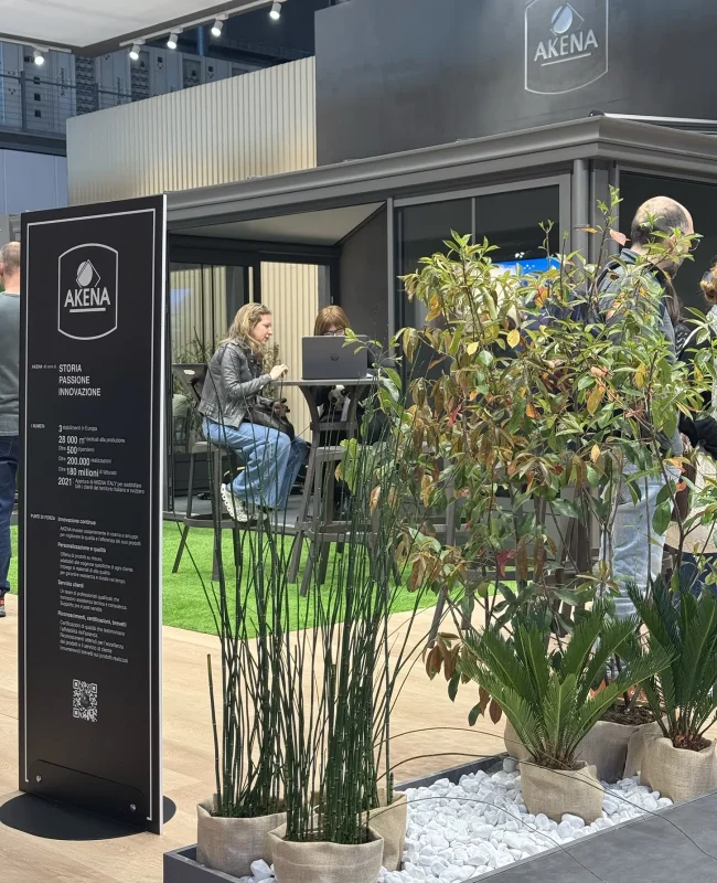
Finally, the goal is not to impress at all costs, but to choose a few truly memorable elements and build a coherent environment around them. Too many visual and aural stimuli overload the senses and make it harder to remember the brand.
Measuring and improving: from post-event to next plant
Each set-up Is also a live test. Observe what happens in the space helps to improve choices on layout, flows e paths in subsequent editions.
Some simple indicators may be:
- average time in the booth;
- Number and quality of meaningful business conversations;
- busiest areas and underutilized areas;
- Recurring critical issues reported by the team or visitors.
Gathering this information, synthesizing it, and using it as a starting point for the next project turns each event into a step forward in continuous improvement of the customer experience.
The Espositiva method: from concept to operational management
The principles described so far find concreteness in the Espositiva method, which focuses on the relationship between brands, people and the exhibition context.
The process starts with a shared analysis of goals, brand identity, and scenario of the trade show or showroom. From here comes a spatial concept that defines how the space, which main stages will make up the path and what role the different areas will play.
La exhibition floor plan is developed by combining layout, functional zoning, management of flows, wayfinding and environmental comfort. Work continues in the operational phase, with site coordination and verification of consistency between design and implementation.
During the event, the observation of the flows real-life and discussions with the client’s team allow them to gather useful insights. Each staging thus becomes the basis for the next one, in a process of continuous refinement.
To learn more about the method, visit our pages on Exhibit, Retail, Corporate spaces e Exhibitions and Events, or find out how we work on layout, zoning and flows.
From square meters to experiences: how to go forward
For marketing managers e designers the key step is to shift the gaze: no longer just asking “how do we fill this space,” but “how do we make the right people experience this space, in the right way.”
Working on spaces, flows e paths With a structured method allows:
- Giving more value to each square meter;
- better connect the investment in fittings to business results;
- Build replicable and consistent exhibition formats over time.
Those who are beginning to plan their next booth o showroom can start with a simple question: what do we want a person to remember coming out of our space, and what path will help them get right there?
From this question begins Espositiva’s work: transforming surface, constraints, and goals into a clear, fluid, and enjoyable experience for the visitor, and measurable for the investor.
FAQ on spaces, flows, and paths in the customer experience
1. How much does the plant really matter compared to the creativity of the layout?
La exhibition floor plan is the backbone of the experience. Very strong creativity applied to a layout confused will still produce a fragmented customer experience. In contrast, a clear floor plan can work even with essential visual language. Ideally, work in parallel: first define goals, functions and flows, then use creativity to make these choices legible and memorable.
2. How to handle small spaces with high flows?
In small spaces, it is even more important to simplify. Better a few well-defined functions than an excess of elements. A open layout, clear entrances, short and linear paths, and a clear distinction between transit and parking areas help to avoid congestion. The choice of essential content, which links to in-depth digital materials, also helps to lighten the exhibition space.
3. How to adapt the same route idea to fairs, showrooms and pop-ups?
The principle remains the same: think of a journey that the visitor takes and the stages that make up the journey. What changes are the conditions. In fair times are tighter and the flow less controllable, so the route needs to be more immediate. In one effective corporate showroom longer, more personalized experiences can be worked on. In temporary pop-ups, quick impact often counts, but always with storytelling logic.
4. What mistakes to avoid when designing the first major set-up?
The most common mistakes are three: starting with aesthetics without a thorough discussion of goals and audience, filling the space out of fear of “emptiness,” and neglecting flows, signage e comfort assuming that people will figure out how to move on their own. By devoting time to these aspects from the beginning, it is possible to build a staging more effective, enhancing each creative choice instead of testing it.
For a face-to-face discussion, talk to the Espositiva team.
With Espositiva, every space
becomes an extraordinary experience.